I have affiliate relationships with Bookshop.org and Malaprop's Bookstore in beautiful Asheville, NC. I will earn a small commission at no additional cost to you if you purchase merchandise through links on my site. Read more on my affiliate page.
Jana at That Artsy Reader Girl invited us to share ten book titles that work as Crayola color names this week. This is a bit abstract for me but I do love colors (there isn’t a white wall in my house back home and I’m trying to convince my husband to let me paint our RV walls) so I’m going to give this a try. (As an aside, I just found the random sort function on my GoodReads shelves and I’m so excited to browse through them this way!)
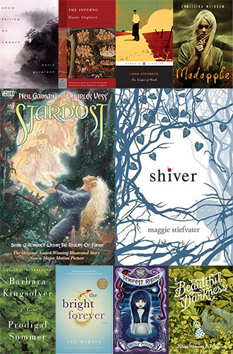
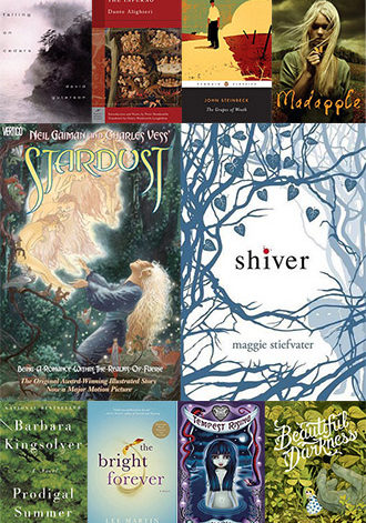
Snow Falling on Cedars (David Guterson)–This would definitely be an off-white but would the undertone be gray since it sounds shadowy? Green from the tree needles? Reddish-orange from the tree bark? This could go in a few different directions.
The Inferno (Dante Alighieri, translated by Henry Wordsworth Longfellow)–My first instinct is that the color is a fiery red. But then I thought about the ninth circle and decided it might be a pure, icy white.
The Grapes of Wrath (John Steinbeck)–A burgundy so dark, it’s almost black.
Madapple (Christina Meldrum)–This would be a poison apple yellowish-green.
Stardust (Neil Gaiman and Charles Vess)–I’ve never cared much for the metallic colors in the Crayola box but this needs to be a soft, mellow gold that actually looks good.
Shiver (Maggie Stiefvater)–I can only think of the blue on the cover when I think of this title.
Prodigal Summer (Barbara Kingsolver)–The lushest green you can imagine, the color of things reaching perfect ripeness at the heart of summer, just before they start to fade and turn brown.
The Bright Forever (Lee Martin)–I don’t know about the rest of the country, but the skies back home in North Carolina in late September and early October are a perfect, cloudless blue that you could fall into forever. This feels like the name of that color.
Tempest Rising (Nicole Peeler)–Obviously a moody gray but it would be tinged with something. I haven’t lived in real hurricane or tornado country but when a bad storm is coming back home, the sky has an ugly yellowish-green cast to it, almost the color of an old bruise. I think that color is part of this gray.
Beautiful Darkness (Fabien Vehlmann, illustrated by Kerascoët, translated by Helge Dascher)–A velvety midnight blue that you want to pull over yourself like a blanket.
That’s my list! Have you read any of these? Do you see the titles as colors? Which books did/would you choose? Link up every Tuesday at That Artsy Reader Girl!
I have an affiliate relationship with Malaprop’s Bookstore/Cafe in beautiful Asheville, NC. I will earn a small commission at no additional cost to you if you purchase merchandise through links on my site.
22 Comments
Great choices! I saw an Oprah show years ago in which one of her guests’ job was to name lipstick colors. I found it fascinating.
Oh these are great descriptions! I especially like Madapple. I mean, who wouldn’t want a crayon with that name?
Right? Every Snow White coloring book should come with a madapple crayon, just to color the poison apple.
Madapple, burgundy for Grapes of Wrath and velvety midnight blue for Beautiful Darkness: those are all some lovely color connections you’ve made. I found it altogether too tough, and just chose some random top 10 topic. But I like how you’ve thought of the books first, then connected colors with their plotlines and book covers, and I love how you’ve described the connection too. Niiice.
~Lex
I was afraid the topic would be too abstract for me but once I got started, I had a lot of fun!
Oooh, STARDUST! I loved the book and I can definitely see it as a shimmery Crayola color.
Happy TTT!
Susan
http://www.blogginboutbooks.com
Stardust is so good! I especially love the version illustrated by Charles Vess. It makes me sad that so many readers prefer the movie over the book.
Ugh, no, the novel is SO much better!
Hi Jen! Aaah beautiful selection! Ha ha ha!! I would love to see your RV painted…I’m the same! My Kitchen wall is red. My husband almost had a heart attack. But now he loves it!!! I love color and my whole house is a Crayola color box.
The Grapes of wrath – yup, I can see that color!
Happy TTT and here’s my Ten Crayola Colors Book Titles
My laundry room is a pastel cantaloupe color back home! My husband let me go crazy on that one. The guest room is buttery yellow and even the garage is a purplish gray! Our house is a creamy yellow (I wouldn’t have chosen that but it’s too expensive to change it) and our outside doors are turquoise. I love color!
Our RV walls are kind of covered in wallpaper and there’s no real way to get it off. My husband is afraid the wallpaper will wrinkle like wet paper or the paint won’t adhere if we paint over it. But I see people painting RV walls all the time on Instagram, so I may wear him down one day.
I’m loving Shiver. It would make a great color.
Right? I can see it in a study or a home theatre, even a cozy bedroom.
These are fun color choices! Though, I’m the opposite. I have always LOVED the metallic Crayons. 😉
My TTT: https://bookwyrmknits.com/2021/04/13/top-ten-tuesday-crayola-crayon-titles/
I like silver but I never cared for the gold or copper. But maybe that’s just personal preference (I like silver and platinum more than gold jewelry).
I think I mostly liked how the metallic shimmer gave the color more of a textured feel than the other crayons. That’s the case for me as an adult, anyway. I love the added texture/depth I feel from a metallic color.
Stardust has been a popular choice this week!
My TTT: https://jjbookblog.wordpress.com/2021/04/13/top-ten-tuesday-311/
Have we all chosen the same color to go with it?
No, I think there has been some variation!
I can’t help but picture a first grader asking a friend to borrow Inferno from her. lol
😂
This is kind of a fun topic. Even though I had a little trouble with it. 🙂 I like Shiver.
I was unsure about it at first but ended up having a lot of fun with it!